Welcome!

A place to explore the method to my madness.

Monday, November 24, 2014

Digital Methods Final

In my Digital Methods class, our final assignment of he semester is to create a digital conceptual portrait of someone using Adobe Photoshop and Adobe Illustrator. A couple posts ago I mentioned that I had recently been working on digital portrait painting. You can see what I've been working on for that here. While a lot of those portraits were based solely on photo reference found on the internet, this time my challenge is to create a portrait of the person I choose that is unique and has never been seen before. And while I can use my previous digital painting experiences to my advantage, I would like to push myself to try new digital painting methods to get a different effect.

So for this project, I chose to use Amy Lee again. I'm interested to see what new things I can create for her portrait considering my last one was pretty straight forward. This time I want to create something that is a spinoff of official Evanescence photos. The band's most recent release was their self-titled album in 2011. Before that, their last album was released when I was in 6th grade in 2006, so imagine my excitement when they announced my (at the time) favorite band's comeback. Anyway, their newest album has a different style of artwork to it, and I'm looking to use that style as a basis for my project. Below are some examples:


I really like the concept of the wild hair and being underwater. It also reminds me of their video for "Going Under", a song off their 2003 album "Fallen". So after lots of thumbnailing and sketching and discussions with my instructor, I have finally come up with a concept and a final layout that I think will work for this assignment.

Concept

I will be having Amy Lee underwater, like in the video and the Oceans photo, singing in a way that makes her look like an underwater, ethereal, banshee. Here are some photos that I have been looking at to help me with facial references:


Step 1: Final Layout

After about 10 changes to my final layout, and multiple changes to composition, this is the basic sketch layout I will be working off of:


Step 2: Value Study

After coming up with a line art layout, the next step is to create a value study. Like the line art, this can be done either traditionally or digitally. I chose to go the digital route. Here are some screenshots and photos of what I was working on yesterday:

Using the line art as a base and placing my reference photo on a different layer on the side, I started adding in basic value on a third and fourth layer. The body is on one layer and for ease of shading the face is on a fourth. Overall, I am probably going a little more in-depth with the shading than is required at this point, but hopefully it will serve me better later.

At this point, I still have things to change and add, but the general concept is starting to show.

When someone screams underwater, the air escaping their lungs makes intense bubbles. While my bubbles are by no means complete or full enough to get the exact effect, I am currently just roughing in their general placement since I will have to go back and do more rendering later. The same can be said for the clawed hand in the front. Here you can see the general process of how I do my digital paintings; I rough in color, starting very general, and then get more specific as I go. In the screenshot, I am still in the process of roughing in the shading and the placement and sizing are still changing.

In Class Critique

Feedback on the image in the screenshot posted above:
- Need to add in some big bubbles (but we already knew this)
- Define the arm wrapped around her body because it looks a little deflated
- Reposition the clawed hand and arm (again, this was already on the "to do" list)
- Highlights in the face; lots of nice soft blending but it's time for some harder edges
- Reflected light that water does is present in the chin but maybe bring some around by the jaw/neck
- Define the neck under the chin/jaw line by adding in some darker values
- The one hair strand is forming a tangent with her jaw that makes it look like a genie beard

Refining the Value Study


Step 3: Color


I really don't like how this colored version came out, so I will probably be reworking it.
Keep an eye out for updates!

Monday, November 17, 2014

Sailor Moon Stars Poster

One of my favorite anime series of all time is Sailor Moon. And of all of the seasons, the Stars season was my favorite. Although it was never dubbed in English and I never saw it until about 7th or 8th grade, this season has some of the best animation and the most compelling story line.

Cel Animation

On a small tangent, I am fascinated with the process of cel animation for this series. Some of the most beautiful animation and most beautiful cels appear in this season. All of the elements in a scene are on different layers. The background has it's own layer, and character cels are placed on top. If there are multiple characters, they will each have their own layer, and moving parts of their body (such as the eyes or the mouth) will have their own layers as well.
Here is an example from SommerBommer on DeviantArt of some of the various types of cels that were used.
The following video is a short clip of the general process of the cel animation for the Sailor Moon series. Every cel is hand shaded, so imagine all the time it would take to create every one of the 200+ episodes and movies for this anime. I can see why the new Sailor Moon Crystal is digitally animated.

Poster Progress

I can go on forever about all of the reasons I love the Stars season of Sailor Moon, but this post is to show some of my progress on the poster I am working on.

Step 1: Line art for the 8 soldiers from our galaxy

Step 2: Line art for the Sailor Starlights

Step 3: Line art for the full body Sailor Moon
Composition is starting to come together, but not all of the elements are there yet. Add more? Why not. Let's make something super cool and interesting. Go big or go home.

Step 4: Line art for the 2nd version of Sailor Moon
At this point composition is really starting to be solidified. I had to add in a 50% gray background just to see the white line art of the 2nd version of Sailor Moon. I'm playing with doing different things with line art so let's see how this will work out.

Step 5: Painting the background
Digital painting of the Milky Way galaxy. This part will ultimately be visible through the 2nd version of Sailor Moon, so it has to look good.

Step 6: Color swatches for each character
Every character has their own distinct color palette. The bottom 2 color palettes are for 2 characters that I haven't done the line art for yet, but just think of it as a little preview for what's coming.

Step 7: Base color for the characters
Here I am applying general blocks of color. It looks like something is missing and it looks really flat, but this would be something that happened when painting the cels for the original animation.

Step 8: Highlights and shadows for the characters
Shading strictly in shapes is a new concept for me, but I think it's starting to look like the Sailor Moon characters. In traditional cell animation of the anime, shaping in the highlights and shadows would happen before the basic blocks of color. This is one of the things I find interesting about this type of animation; things have to be done backward.

Step 9: Put it against the background
Dark line art and dark shapes against a dark background create some really bad edge relationships that make this design seem flat. Lots of the different character's parts disappear, especially in the hair and dark uniforms of the Starlights. Something will have to be done to fix this.

Step 10: Coloring of 2nd Sailor Moon and edge effects for other characters
To fix my edge relationships, I played around with layer effects. Generally, I hate the use of Photoshop's layer effects and filters, but in this case, I think they actually saved the piece. Weird... As for the white lined Sailor Moon, I chose to do a more transparent type of shading so the background is still visible. Lot's of masking techniques were used here, but I think overall this style seems to help connect the characters to the background.

Step 11: Adding in 2 more characters on the bottom (some repositioning occurring)
The bottom looked boring but a giant Sailor Moon logo would almost be a cop-out for this poster. Since two of the most important characters in the series aren't making an appearance in the poster yet, it's time they did. And what better place to put them than a place that screams for attention.

Step 12: Adding base colors to the bottom characters
The bottom two characters need edge effects too, and of course they need to be colored. I'm using the same method here as I used to color the other characters, so the only thing happening here is the application of base colors.

Step 13: Adding shadows and highlights the two bottom characters. Nudged the two characters slightly to the right (almost imperceptible but it would have drove me crazy if I left it).

If I eliminate the base color layer, this is what my highlights and shadows coloring layer looks like.

Step 14: Creation of vector of the Sailor Moon Stars Japanese logo based on:

Step 15: My final logo from Adobe Illustrator

Step 16: Final placement and edits to logo.

Step 17: Creation of US Sailor Moon logo in Adobe Illustrator

After adding in the last logo and doing some final touches and clean up....


I then printed smaller test prints at about 21 in x 16 in, and then pulled the trigger and had it printed on my school's 44 in roll printer. Here is a look at the final hanging in my dorm room (with someone on the bed of course):

And in case you're interested in what the other half of my room looks like:

UPDATE: Because it was printed on a roll printer and was particularly curly when I hung it, the poster scared the crap out of me at 3:30 in the morning when it curled itself off the wall. It is now rehung with 2x the tape and hopefully will not fall off again while I'm sleeping any time soon.

3 Years Since My Last Update

Yep. You read that correctly. It's been 3 years since my last update and I had to jump through at least 10 hoops to find this blog again, figure out what email the blogger account was under, and then figure out the password so I can create a blog entry. Which will most likely go unseen until I find the energy to promote my blog. If you are here reading this, possibly because I have told you about it, thank you.

School Work

Within the past 3 years I have graduated high school and completed almost 3 semesters at the Columbus College of Art & Design. While most of my high school work might remain hidden forever, my freshman work (and some high school work) can be viewed here, and my sophomore work can be viewed here.

Personal Work

Even with all of the school work I have been doing there has still been some time to work on my own things. A lot of them can be seen on my DeviantArt Page, CAB-Art. Here are some lower-resolution pictures with some comments:

Zac Efron
Digital Portrait Painting
Adobe Photoshop
This one was my first legitimate attempt at doing a portrait painting. The internet reference picture was on one side of the screen and photoshop was open on the other. I started basically blocking in shapes, then slowly worked that into a simple black and white value study underpainting to establish values for the piece. Once that was done I went in and added color.

Amy Lee
Digital Portrait Painting
Adobe Photoshop
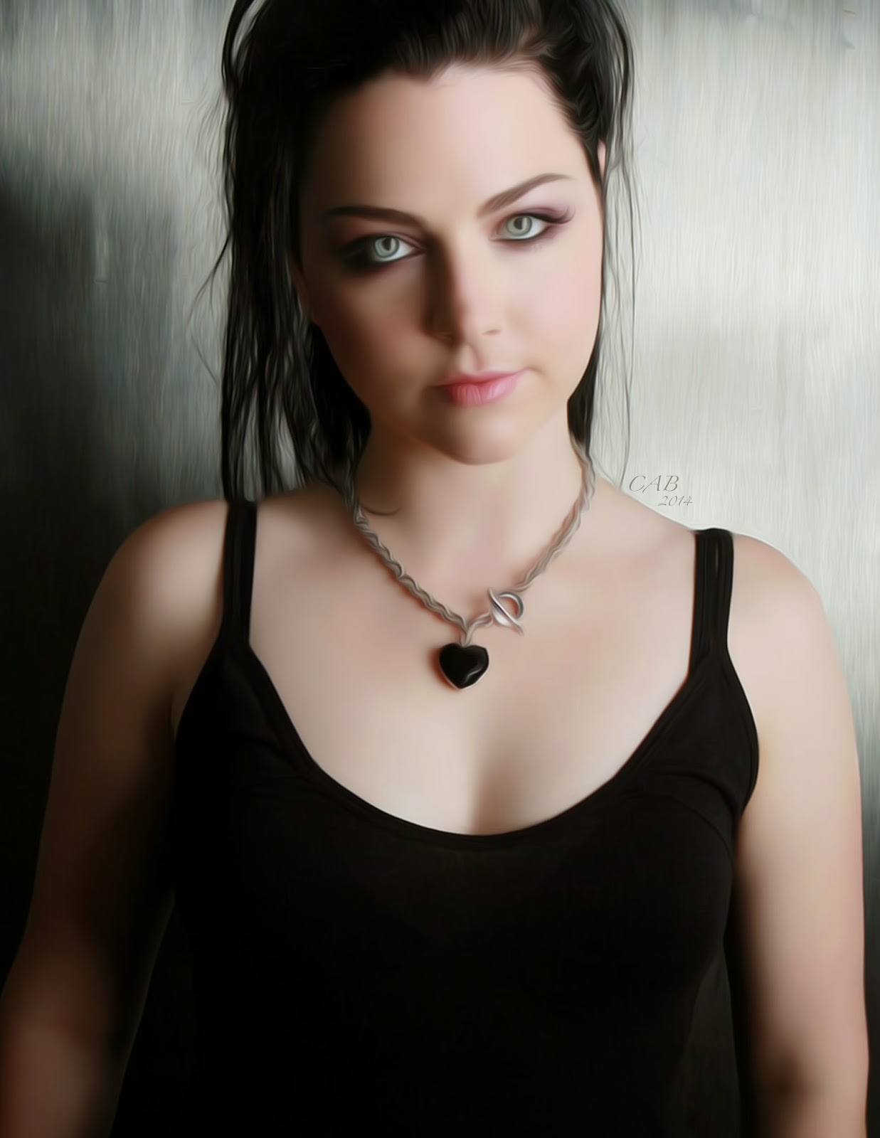
My second portrait was of Amy Lee. I idealized a lot of the shading in this one. Again, I started with a black and white value study underneath and then layered color over it.

Laura Vandervoort
Digital Portrait Painting
Adobe Photoshop
Third attempt at digital portraiture. This time I was focussing on methods for rendering texture in the hair and in the shirt. Some of the shadows in her neck also gave me some wonderful practice.

Alex Pettyfer
Digital Portrait Painting
Adobe Photoshop
Alex was my 4th portrait. Again, I was playing with  how to render textures by painting. This time I focussed mainly on the texture in the skin, lips, and hair.

Ian Somerhalder
Digital Portrait Painting
Adobe Photoshop
In my next portrait I combined all those methods and lessons into a portrait of my favorite actor, Ian Somerhalder. This one was a little more difficult and time consuming, but I think I eventually got what I was looking for. I still have some things to learn but I think I have a good start.

Crystal
Digital Painting
Adobe Photoshop
Sometimes painting portrait after portrait gets boring, so after playing around with Ian's portrait I went and tried something a little different. I pulled up a picture of a crystal on the internet and just studied the way glass reflects light and influences color. Crystals are such a fun thing to paint for this.


I have also been working on a giant 30 in x 40 in Sailor Moon Stars Poster in my free time. I started working on it over the summer and got about 75% of the way done, but with all my school work I haven't quite found time to complete it just yet. Maybe over winter break I will be able to sit down and finish it. My next post will be coming soon and will talk about my steps and progress on that monster. Until then, thanks for viewing!